

TL;DR: HTML email design is judged twice, once by the reader and once by the mailbox provider, so build for the weakest client and the strictest filter. Use a single-column table layout with inline styles, keep your message in live text instead of images, set body copy at 16px or larger with web-safe font stacks, and write alt attributes that still deliver the point when images are blocked. Code buttons in HTML rather than exporting them, keep rendered HTML under the Gmail clipping threshold, and check contrast and unsubscribe visibility.
HTML email design best practices are the layout, coding, and accessibility rules that keep a template rendering correctly across email clients while protecting inbox placement. Build on a single-column table structure, keep your copy in live text, declare web-safe font fallbacks, write descriptive alt attributes, and preview in real clients before you send.
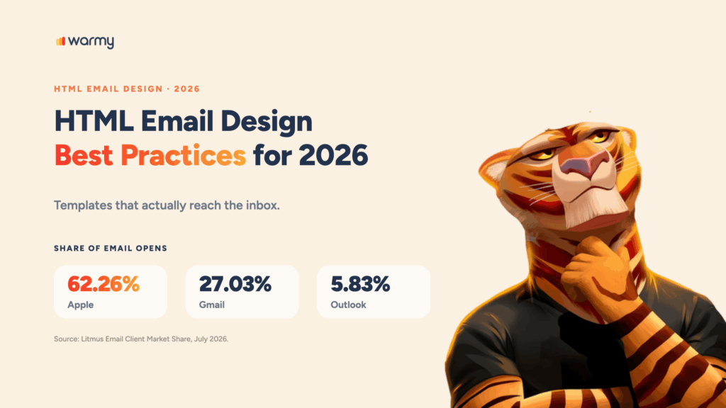
Two environments decide how most of your campaigns look. Litmus measured Apple at 62.26% of email opens and Gmail at 27.03% in its July 2026 report, with desktop Outlook third at 5.83%.
Warmy is an AI-driven email warmup and deliverability platform, and its free Template Checker catches those problems before a send goes out. What follows covers layout, mobile adaptation, typography, images, buttons, accessibility, and dark mode, with copy-and-paste markup for the template you already have.
What HTML email design is, and why it isn’t web design
HTML email design is the practice of coding a message with nested tables and inline CSS so it renders predictably in dozens of email clients, including one built on a word processor. Web design targets a single standards-compliant browser. Email design targets whatever the recipient happens to open, and those clients disagree about almost everything.
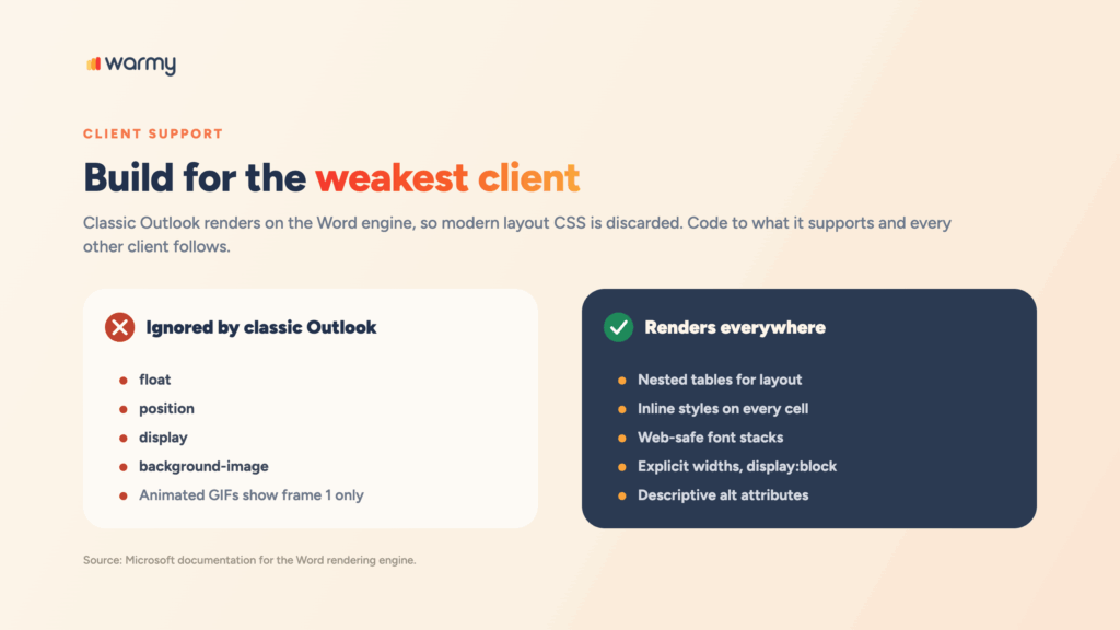
Classic Outlook is the sharpest example. Microsoft documentation for its Word rendering engine lists float, position, display, and background-image among the CSS properties it doesn’t support, and animated GIFs show only their first frame.
Here’s what that rules out, and what replaces it:
<!-- Ignored by classic Outlook -->
<div style="display:flex; justify-content:space-between;">
  <div>Left</div>
  <div>Right</div>
</div>

<!-- Renders everywhere -->
<table role="presentation" width="600" cellpadding="0"
       cellspacing="0" border="0">
  <tr>
    <td width="300" style="font-family:Arial, Helvetica, sans-serif;">Left</td>
    <td width="300" style="font-family:Arial, Helvetica, sans-serif;">Right</td>
  </tr>
</table>
Nested tables, inline styles, web-safe type stacks. That’s the whole discipline behind HTML email best practices, and it hasn’t changed much in a decade.
| Factor | Web design | HTML email design |
|---|---|---|
| Rendering | One standards-compliant browser | Dozens of clients, one built on a word processor |
| Layout | Flexbox and CSS Grid | Nested tables with inline styles |
| Styles | External CSS files | Inline styles, style block as enhancement |
| Typography | Any webfont | Web-safe stacks with fallbacks |
| Size ceiling | Effectively none | Gmail clips HTML above roughly 102KB |
| Testing | Browser dev tools | Client-by-client preview before every send |
How email design affects deliverability
Email design affects deliverability because filters read the message itself alongside your sending reputation, and a template that renders badly kills the engagement your reputation depends on. Google’s sender guidelines make the stakes concrete: a user-reported spam rate at or above 0.3% makes a bulk sender ineligible for delivery mitigation until it stays below that line for seven consecutive days.
A template that renders badly gets deleted without engagement, which erodes reputation over time. An image-only design gives filters almost no text to evaluate. A buried unsubscribe link turns quiet opt-outs into complaints, because a reader who can’t find the exit reaches for the spam button instead.
Copy carries risk too, which is why it pays to learn which words trigger spam filters in your template. And to see where a template actually lands, run a full deliverability check.
Pro Tip: Authentication and design fail in different places. SPF, DKIM, and DMARC prove who sent the message. The template decides whether it looks worth delivering once that check passes.
Before your next campaign, test your template with our free Template Checker and fix what it flags.
Layout fundamentals: single column, multi-column, and hybrid
Single column is the safest email layout for almost every campaign, because it reflows predictably on small screens, survives the Word engine, and stays readable even when media queries get stripped. Multi-column and hybrid layouts are workable, but each one needs a plan for the moment those columns can no longer sit side by side.
Here is the skeleton to start from:
<!DOCTYPE html>
<html lang="en">
<head>
  <meta charset="utf-8">
  <meta name="viewport" content="width=device-width, initial-scale=1">
  <title>Your subject line</title>
</head>
<body style="margin:0; padding:0; background-color:#f4f4f4;">
  <table role="presentation" width="100%" cellpadding="0" cellspacing="0"
         border="0" style="background-color:#f4f4f4;">
    <tr>
      <td align="center" style="padding:24px 16px;">

        <table role="presentation" width="600" cellpadding="0" cellspacing="0"
               border="0" class="container"
               style="width:600px; max-width:600px; background-color:#ffffff;">
          <tr>
            <td class="p-mobile"
                style="padding:32px 24px; font-family:Arial, Helvetica, sans-serif;
                       font-size:16px; line-height:24px; color:#1a1a1a;">
              Your content goes here.
            </td>
          </tr>
        </table>

      </td>
    </tr>
  </table>
</body>
</html>
Hybrid layout (sometimes called spongy) swaps that fixed 600px column for inline-block containers with max-width values, which lets blocks stack as the viewport narrows without depending on media query support at all. It costs you extra markup, and that matters later when we get to file size.
Whichever layout you pick, check the exact pixel and file-size limits for your template before you build.
| Layout type | When to use it | Rendering and deliverability risk |
|---|---|---|
| Single column | Newsletters, transactional mail, cold outreach | Lowest. Reflows without media queries and renders consistently in classic Outlook. |
| Multi-column | Product grids where side-by-side comparison matters | Moderate. Columns that fail to stack force horizontal scrolling. |
| Hybrid (spongy) | Complex layouts for Outlook-heavy audiences | Moderate. Robust, but extra markup adds weight toward the clipping threshold. |
Mobile-first and responsive email design
Mobile-first email design means building the small-screen version first and treating the desktop layout as the enhancement: one column, a comfortable base font size, generous tap targets, and one primary action visible without scrolling. Responsive email design then adapts that base upward with media queries, on the understanding that plenty of clients will throw those media queries away.
The media query lives in a style block in the head, and the fallback lives in the inline styles underneath it:
<style>
  @media only screen and (max-width: 480px) {
    .container { width: 100% !important; max-width: 100% !important; }
    .stack     { display: block !important; width: 100% !important; }
    .p-mobile  { padding: 20px 16px !important; }
    .btn       { width: 100% !important; text-align: center !important; }
  }
</style>
Note the order there. Inline styles carry the desktop rendering, and the media query overrides them on small screens, which means a client that strips the style block still shows a usable email.
| Breakpoint | Typical devices | What to change |
|---|---|---|
| Up to 480px | Phones in portrait | Single column, body text at 16px or more, full-width buttons, side padding of 16px to 20px. |
| 481px to 768px | Phones in landscape, small tablets | Two columns at most, images fluid at 100 percent width with height set to auto. |
| 769px and above | Tablets in landscape, desktop clients | Full layout in a fixed container, usually 600px, centered on a background color. |
Typography and web-safe fonts
Web-safe fonts declared inside a fallback stack are the reliable approach to email typography, because webfont support is uneven and a font that fails to load hands the decision to the client. Name your preferred family first, then a web-safe alternative, then a generic family:
<td style="font-family:'Helvetica Neue', Helvetica, Arial, sans-serif;
           font-size:16px; line-height:24px; color:#1a1a1a;">
  Live text, not a picture of text.
</td>
Set body copy at 16px or larger. Anything smaller triggers automatic scaling on some mobile clients, and you lose control of the layout you just built. Keep line height near 1.5 and line length somewhere in the 50 to 75 character range, which is wide enough to read comfortably without forcing the eye to hunt for the start of the next line.
Copy rendered as an image can’t be read by filters, screen readers, or recipients browsing with images off, and that includes your headline.
Images, GIFs, and visual content
Every image in an HTML email needs a descriptive alt attribute, an explicit width, and display:block, because a meaningful share of your audience sees the alt text before they see the picture. Microsoft documents that Outlook blocks automatic picture downloads by default, which means your first impression is often a stack of empty boxes.
<img src="https://yourdomain.com/images/spring-sale.png"
     alt="Spring sale, 30% off through Sunday"
     width="600"
     style="display:block; width:100%; max-width:600px;
            height:auto; border:0;">
Write alt attributes that carry the message instead of describing the file. “Spring sale, 30% off through Sunday” does a job for you. “hero-banner-final-v3.png” does nothing.
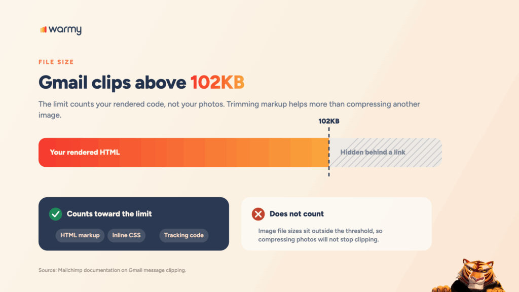
On the other hand, Mailchimp documents that Gmail clips messages whose code exceeds roughly 102KB and hides the rest behind a link, and (this is the part that catches people out) the limit counts HTML, inline CSS, and tracking code rather than image files. Trimming markup helps more than compressing another photo.
CTA and button design
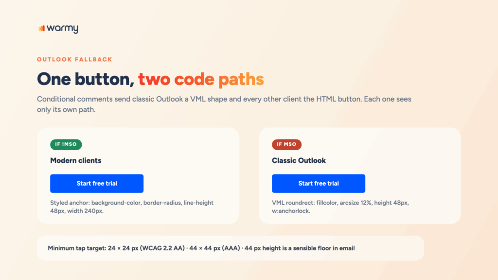
Code your CTA buttons in HTML and CSS instead of exporting them as images. Size them for fingers rather than cursors. WCAG 2.2 sets a minimum target size of 24 by 24 CSS pixels at Level AA and 44 by 44 at Level AAA, and 44 pixels of height is a sensible working minimum for a primary button in email.
Classic Outlook needs VML to hold the background color and rounded corners. The conditional comments below are invisible to every other client:
<!--[if mso]>
<v:roundrect xmlns:v="urn:schemas-microsoft-com:vml"
             xmlns:w="urn:schemas-microsoft-com:office:word"
             href="https://yourdomain.com/offer"
             style="height:48px; v-text-anchor:middle; width:240px;"
             arcsize="12%" strokecolor="#0057FF" fillcolor="#0057FF">
  <w:anchorlock/>
  <center style="color:#ffffff; font-family:Arial, sans-serif;
                 font-size:16px; font-weight:bold;">Start free trial</center>
</v:roundrect>
<![endif]-->

<!--[if !mso]><!-- -->
<a href="https://yourdomain.com/offer" class="btn"
   style="background-color:#0057FF; border-radius:6px; color:#ffffff;
          display:inline-block; font-family:Arial, Helvetica, sans-serif;
          font-size:16px; font-weight:bold; line-height:48px;
          text-align:center; text-decoration:none; width:240px;">
  Start free trial
</a>
<!--<![endif]-->
Email accessibility essentials
Accessible email design comes down to four pieces of markup: a language declaration on the html element, real heading tags in order, layout tables marked as presentational, and a text alternative on every meaningful image.
<html lang="en">

<table role="presentation" cellpadding="0" cellspacing="0" border="0">
  <tr>
    <td>
      <h1 style="font-size:24px; line-height:32px; margin:0 0 16px;">Main heading</h1>
      <h2 style="font-size:20px; line-height:28px; margin:0 0 12px;">Section heading</h2>
      <p style="font-size:16px; line-height:24px; margin:0 0 16px;">Body copy.</p>

      <!-- decorative image: empty alt tells screen readers to skip it -->
      <img src="divider.png" alt="" width="600" style="display:block; border:0;">
    </td>
  </tr>
</table>
An empty alt attribute is the correct choice when the image is purely decorative. It tells assistive tech to move on, which is exactly what you want for a spacer or a divider line, and it is a different decision from forgetting the attribute entirely.
| Requirement | Minimum standard | Why it matters in email |
|---|---|---|
| Text contrast | 4.5:1 body text, 3:1 large text (WCAG 2.2, AA) | Low-contrast type fails in dark mode and on phones in daylight. |
| Target size | 24 by 24 CSS pixels (AA); 44 by 44 (AAA) | Undersized buttons cause mis-taps, and mis-taps produce deletions. |
| Text alternatives | Descriptive alt on every meaningful image | Carries the message when images are blocked or a screen reader is used. |
| Semantic structure | Heading tags in order, layout tables presentational | Lets assistive tech navigate instead of reading scaffolding aloud. |
| Color independence | Never use color as the only carrier of meaning | Color vision deficiency and dark mode inversion remove that signal. |
Designing for dark mode
Designing for dark mode in email means making one template survive inversion rather than building a second version of it. Litmus puts dark mode adoption above a quarter of the user base, and clients handle it three different ways: some leave the email untouched, some invert only pure white, and some invert the entire palette.
Declaring color-scheme support tells the clients that respect it to stop guessing:
<meta name="color-scheme" content="light dark">
<meta name="supported-color-schemes" content="light dark">- Use transparent logo files, because a logo baked onto white leaves a visible box after inversion.
- Avoid pure white (#FFFFFF) and pure black (#000000), the two values inverted most aggressively.
- Add a light stroke to dark logos and icons so they stay visible against a dark background.
- Test in Apple Mail and Outlook. Their inversion behavior differs the most.
Common HTML email design mistakes that hurt deliverability
Most underperforming campaigns fail on a short list of repeat offenders, and every item below is a design decision rather than an authentication problem.
- Designing one image and calling it an email, which leaves filters no text to evaluate.
- Leaving alt attributes empty on meaningful images, turning blocked pictures into blank space.
- Building layouts with CSS positioning or flexbox that classic Outlook ignores outright.
- Setting body text below 16px and triggering automatic scaling on mobile.
- Shipping heavy code that pushes the message past the clipping threshold.
- Hiding the unsubscribe link in low-contrast type, which converts opt-outs into complaints.
- Testing only in the client the designer happens to use, then finding the problem after the send.
Headers get treated as decoration rather than structure just as often, and it is worth reading our full guide to email header design before you rebuild yours.
Pre-send testing checklist
Email client testing is what separates a template you hope works from one you know works. Run these five checks before every send:
- Preview in Apple Mail, Gmail on web and mobile, and classic Outlook.
- View the email with images disabled and confirm it still makes sense from alt text alone.
- Switch to dark mode in two clients and check logos, icons, and backgrounds.
- Check rendered HTML size against the Gmail clipping threshold, then click every link, unsubscribe included.
- Scan copy and structure for spam triggers and formatting problems before you queue the send.
Conclusion
If you take one rule from this guide, take the first one: design for the least capable client, and every other environment tends to take care of itself. Single column, live text, web-safe fonts, real alt attributes, and honest contrast will outperform whatever visual flourish you are tempted to add on top.
Start with the skeleton above, paste your content into it, then run it through the Template Checker and fix what comes back. A clean sign-off reinforces the same signals, and you can build a professional signature in seconds. If the template is solid and placement still is not, book a demo and see how Warmy builds the sender reputation underneath it.