

TL;DR: Relying on image-based buttons can silently ruin your email conversions if an email client blocks images. This guide by Warmy provides the paste-ready HTML/CSS code to build reliable “bulletproof buttons” that render perfectly everywhere, plus the essential tweaks to format phone links correctly and stop iOS from turning order numbers into accidental calls.
Your subject line earns the open, and your copy earns the interest. But when the reader finally reaches the point of action, they often find a gray rectangle with a broken image icon where your email button should be. The solution is a bulletproof button. Rather than an image, this is a call to action coded entirely in HTML and CSS to display perfectly in every email client.
By styling an anchor tag with padding, a background color, and conditional Outlook markup, you ensure the entire rectangle is clickable. Of the five reliable techniques, conditional padding is the one to reach for by default.
Phone links break differently, but just as quietly. The href must carry a leading plus sign and the country code. Additionally, a format-detection meta tag is essential to stop iOS from turning standard order numbers into accidental call links.
Warmy is an AI-driven email warm-up and deliverability platform that helps senders reach the primary inbox and stay there. This guide covers these two frequently miscoded HTML email elements, providing clean code you can paste straight into your template.
Why image-based buttons fail in email
Image-based buttons fail in email because they disappear for anyone reading with images blocked and hand a screen reader nothing to announce beyond your alt text. An image is the only way to guarantee a button looks identical everywhere, which is why designers keep reaching for one, and Litmus still advises against it: that guarantee holds only for recipients with images switched on who aren’t using assistive tech.
When Gmail began loading images automatically at the end of 2013, Litmus compared open rates before and after and found that 57% of Gmail users had previously turned images on, leaving 43% reading with images off. Litmus published that in May 2014 and now describes the figure in the past tense, which makes it evidence that image blocking was once widespread rather than a current measurement.
What is a bulletproof button?
A bulletproof button is assembled from HTML and CSS rather than a graphic: the label is live text, the shape comes from padding or borders, and the color is applied through code. Litmus groups the reliable approaches into five techniques, which differ in where the styling lives and how each one degrades in Outlook, whose desktop versions ignore rounded corners and handle horizontal padding inconsistently.
| Technique | How the shape is built | Rounded corners in Outlook | Best suited to |
|---|---|---|---|
| Conditional padding | Padding on the link; Outlook spacing via conditional comments | No | Most senders; one code block, fully clickable |
| VML | Vector Markup Language draws a shape behind the link | Yes | Designs needing rounded corners in Outlook |
| Padding | Padding on a table cell forms the box | No | Simple templates; only the label is clickable |
| Border | Thick borders on the link replace padding | No | Scalable buttons, no fixed dimensions |
| Padding and border | Padding plus a border on the link, background on the cell | No | Templates with a background image behind the button |
One caveat applies to VML. Litmus notes that it introduces accessibility complications and now recommends moving away from it, which turns rounded corners in Outlook into a preference rather than a requirement.
How to code a bulletproof button (copy-paste HTML)
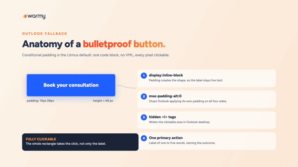
Conditional padding is the technique Litmus uses in its own campaigns and the safest default for an HTML email button. All the styling sits on the anchor tag, which keeps the whole rectangle clickable, and the conditional comment supplies the spacing Outlook would otherwise collapse.
<a href="https://example.com/consultation" class="btn"
style="background-color:#1F5EFF; border-radius:6px; color:#ffffff;
display:inline-block; font-family:Arial, Helvetica, sans-serif;
font-size:16px; font-weight:bold; line-height:20px;
padding:14px 28px; text-decoration:none; mso-padding-alt:0;">
<!--[if mso]>
<i style="mso-font-width:100%; mso-text-raise:26pt" hidden> </i>
<span style="mso-text-raise:13pt;">
<![endif]-->
Book your consultation
<!--[if mso]>
</span>
<i style="mso-font-width:100%;" hidden> ​</i>
<![endif]-->
</a>Three details separate this from a web button dropped into an email. Inline-block display lets the padding create the shape. The mso-padding-alt declaration stops Outlook from applying its own padding on all four sides. And the hidden italic tags, which look like clutter until you test without them, are what widen the clickable area in Outlook.
For newsletter buttons that should stretch on small screens, add a media query that switches the anchor to display block:
<style>
  @media only screen and (max-width: 480px) {
    .btn {
      display: block !important;
      width: 100% !important;
      text-align: center !important;
    }
  }
</style>
Button size and placement best practices
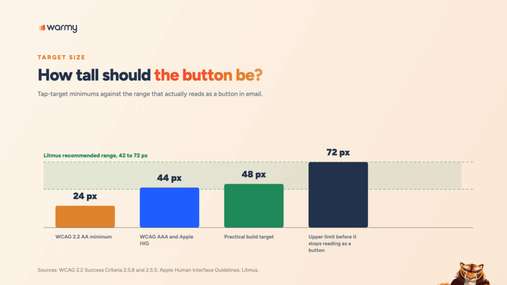
Build email buttons at roughly 48 pixels tall with generous horizontal padding, and keep the primary one visible before the reader scrolls. A button that renders correctly can still be hard to hit, which is what the accessibility guidance addresses.
WCAG 2.2, a W3C Recommendation since December 2024, sets the floor: Success Criterion 2.5.8 requires pointer targets of at least 24 by 24 CSS pixels at Level AA, and 2.5.5 raises that to 44 by 44 at Level AAA. Apple’s Human Interface Guidelines agree, specifying a 44-point minimum tappable area.
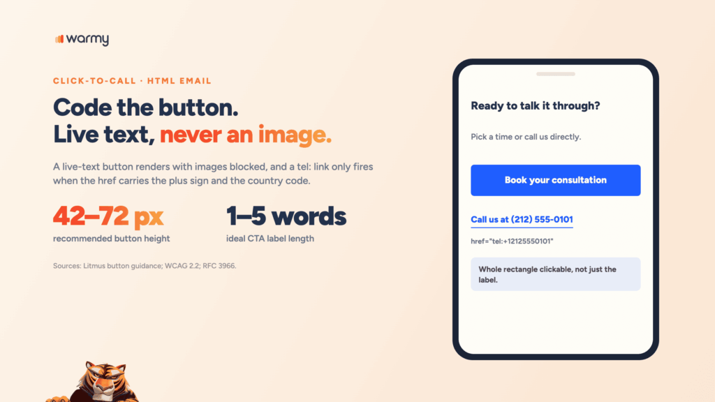
For email specifically, Litmus recommends a height between 42 and 72 pixels because buttons below that range get missed on a phone, and buttons above it stop being read as buttons at all.
Spacing matters as much as size. Crowded buttons invite mis-taps even when each one is large enough on its own, and making sure the rest of your template follows best practices keeps the button from competing with an oversized header.
Writing CTA copy that gets clicked
Strong CTA email copy tells the reader what happens next in the fewest words that still carry meaning, and Litmus recommends keeping the label between one and five words. Four rules cover most cases:
- Name the outcome instead of the mechanism. “Book your consultation” beats “Submit” every time.
- Start with a verb. A call to action button in email works when the label reads as an instruction.
- Give one email one primary action. A second button competing for the same click usually reduces both.
- Match the label to the landing page, because mismatches train people to stop clicking your email CTA.
How to make a phone number clickable in an email
You make a phone number clickable in an email with an anchor tag whose href uses the tel: scheme instead of a web address. The reader taps it and the dialer opens with the number already filled in.
Formatting inside the href is where most implementations go wrong. RFC 3966, the IETF specification for the tel: URI, states that globally unique numbers are identified by a leading plus sign and composed with the country code, and that on a public HTML page the number should always appear in global form even when the visible label uses a local format.
<!-- In the <head> of your template -->
<meta name="format-detection" content="telephone=no">

<!-- In the body -->
<a href="tel:+12125550101"
   style="color:#1F5EFF; font-family:Arial, Helvetica, sans-serif;
          font-size:16px; font-weight:bold; text-decoration:underline;">
  Call us at (212) 555-0101
</a>
The format-detection tag does the opposite of what its name suggests. Apple’s Safari HTML Reference documents it as an Apple extension: Safari on iOS turns any string resembling a phone number into a call link by default, and telephone=no switches that off. Your explicit tel: link keeps working and keeps its styling, while order numbers and dates stop getting auto-linked.
To present the phone number as a button, wrap the tel: href in the button code above. One note from Litmus worth acting on: Gmail ignores clickable phone number styles declared in the head, which is why the styling above sits inline.
Click-to-call behavior across devices and clients
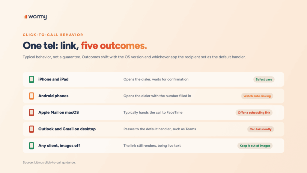
A tel: link doesn’t behave identically everywhere, and the differences are large enough to change what you send. Treat the table below as typical behavior rather than a guarantee, since outcomes shift with the operating system version and with whichever app the recipient set as their default handler.
| Device or client | Typical behavior | What to plan for |
|---|---|---|
| iPhone and iPad | Opens the dialer, waits for confirmation | Safest case; the tap is reversible |
| Android phones | Opens the dialer with the number filled in | Auto-linking may restyle numbers you did not link |
| Apple Mail on macOS | Typically hands the call to FaceTime | Without FaceTime set up, nothing may happen |
| Outlook and Gmail on desktop | Passes to the default tel: handler, such as Teams | With no handler set, the click fails silently |
| Any client, images off | The link still renders, being live text | Only if the number is not inside an image |
The macOS case surprises people. Litmus warns senders with a large Apple Mail audience that click-to-call on a Mac opens FaceTime, which is a very different experience from a dialer.
Pro Tip: Hide the click-to-call link on desktop and show a scheduling link instead. Litmus documents this pattern, and it keeps mobile frictionless without stranding desktop readers in an app they never set up.
<style>
  .call-link { display: none; }
  @media only screen and (max-width: 480px) {
    .call-link { display: inline-block !important; }
    .book-link { display: none !important; }
  }
</style>

<a href="tel:+12125550101" class="call-link"
   style="color:#1F5EFF; font-weight:bold;">Call us now</a>

<a href="https://example.com/book" class="book-link"
   style="color:#1F5EFF; font-weight:bold;">Book a time</a>
Test that one before you trust it. A client that strips the style block will show both links at once, which is untidy but harmless, and it beats the alternative of a desktop reader tapping into nothing.
When to use a clickable phone number (and when not to)
Click-to-call earns its place when the reply you want is a conversation and speed decides the outcome. Litmus points to several cases where it works:
- Support and service recovery, where a frustrated customer won’t wait for email.
- Returns and order problems, faster to resolve by voice than through a web form.
- Consultations and booked calls, where the number is the offer rather than a footer detail.
- Post-purchase feedback, where a short call yields more than a survey link.
Two situations call for leaving it out. If your team can’t absorb the call volume, the button just routes people into a hold queue and makes the experience worse than no button at all. And in cold outreach, an unsolicited invitation to phone a stranger rarely converts.
Common mistakes that hurt deliverability and UX
Several button and phone-number habits create problems that reach past design and into the inbox.
- Putting the call to action inside an image, which fails for anyone with images off.
- Making only the label clickable rather than the full button area.
- Writing the tel: href with parentheses, spaces, or no country code.
- Stacking three or four buttons until no single action stands out.
- Skipping alt text on the images that remain, removing the last fallback.
- Relying on a heavy image-to-text ratio, which content filters weigh.
- Leaving auto-detected numbers unstyled, which lets iOS turn reference codes into blue call links.
The deliverability connection is more specific than it’s usually described. A broken button doesn’t damage sender reputation on its own, and Google publishes no click-through metric as a reputation input, but Google does publish a threshold on user-reported spam: its sender guidelines instruct senders to keep the Postmaster Tools spam rate below 0.10% and never let it reach 0.30%.
A recipient who wants to act and finds nothing that works tends to delete or report the message, and enough of those reports move the one metric providers actually enforce.
Warmy’s deliverability insights cover the monitoring side, from domain reputation to blacklist status and authentication records.
Pre-send testing checklist
Work through this list before any campaign that depends on a click or a call.
- Preview with images disabled and confirm every call to action is still visible.
- Tap the full button area, not only the label, on an iPhone and an Android device.
- Open the message in Outlook desktop and check that the padding held.
- Send a test to a Gmail address and confirm the phone number styling survived.
- Verify the tel: href uses a leading plus sign, the country code, and digits only.
- Confirm the format-detection tag is present if the email carries order numbers or dates.
- Run a screen reader over the message and listen to how each call to action is announced.
- Check that every button opens the destination its label promises.
Warmy’s free Template Checker automates part of this, scanning your HTML and content for the issues filters react to, and a Chrome extension lets you run it inside your existing workflow.
Conclusion
Bulletproof email buttons and click-to-call links solve the same problem from two directions, replacing a fragile graphic with live text that renders everywhere and gives assistive technology something to work with.
Start with the conditional padding block above, add the tel: link with a proper country code, then run the eight checks before you send. If the buttons are clean and the campaign still underperforms, the problem sits upstream in inbox placement. Book a demo and see how Warmy builds and protects the sender reputation your campaigns run on.