


TL;DR: Web fonts often malfunction in popular email clients like Gmail and Outlook. That is why your campaigns need a proper font stack with a pre-installed, web-safe fallback font. Without one, teams may panic and send image-only emails, which ruins accessibility and destroys the engagement signals required for good deliverability.
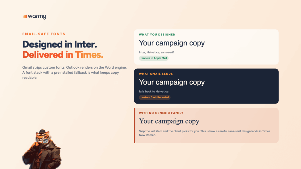
Your brand font looks flawless in the design file. However, when the campaign is sent out, a large percentage of your subscribers will open it in Times New Roman.
This discrepancy exemplifies the problem with email typography. Gmail routinely strips custom fonts. Outlook for Windows uses the Microsoft Word engine to render everything and makes its own unpredictable formatting decisions. The best font for your emails has much less to do with visual preference and much more to do with which fonts actually survive the trip to the inbox.
While most marketing teams file email fonts strictly under design, they also belong in the deliverability category. When a custom font doesn’t work and someone tries to fix it by exporting the entire message as one flat image, accessibility decreases.
Email-safe fonts are typefaces that reliably render in every major email client because they are already installed on the recipient’s device. The core set includes Arial, Helvetica, Georgia, Verdana, Tahoma, Times New Roman, and Courier New. Simply include one of these fonts in your font stack and end with a generic font family to ensure your copy remains readable everywhere it lands.
Web Fonts vs. Web-Safe Fonts vs. Email-Safe Fonts
What are web safe fonts? They’re typefaces pre-installed on virtually every operating system. Nothing downloads. The client finds the font locally and draws the text, which keeps rendering consistent across devices and clients.
Web fonts live on a server and get pulled in with @font-face, @import, or a <link> tag. They work beautifully on the web and unevenly in email. Can I Email’s support matrix shows @font-face working in Apple Mail, only partially working in Outlook, and unsupported in Gmail and Yahoo Mail.
Email safe fonts are the tighter subset that holds up once email clients start rewriting your CSS. Every email-safe font is web-safe.
Why Font Choice Affects Email Deliverability
A font that fails to render makes the message harder to read. Harder to read produces fewer opens, fewer clicks, faster deletes, and the occasional complaint from a reader who couldn’t work out what they were looking at. Those behavioral signals are what Gmail, Outlook, and Yahoo weigh when they decide where your next campaign lands.
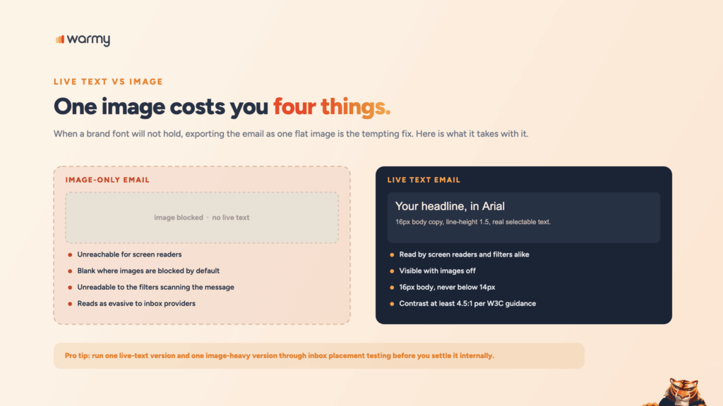
A designer can’t get the brand font to hold, and the fix becomes exporting the entire email as one image. That copy is now unreachable for screen readers, blank in any client that blocks images by default, and unreadable to the filters scanning your message. An email that is almost entirely image with no live text reads as evasive.
W3C’s accessibility guidance is blunt here: use real text rather than images of text, and hold body copy to a contrast ratio of at least 4.5:1 against its background.
Pro Tip: Run one live-text version and one image-heavy version of the same email through inbox placement testing before you settle the debate internally.
The Best Web-Safe Fonts for Email in 2026
Below is the working web safe fonts list. These are the good email fonts that hold across clients, each with a ready fallback stack.
| Font | Type | Where it’s safe | Recommended fallback stack |
|---|---|---|---|
| Arial | Sans-serif | Every major client, Windows and macOS | Arial, Helvetica, sans-serif |
| Helvetica | Sans-serif | Native on macOS and iOS; Windows substitutes Arial | Helvetica, Arial, sans-serif |
| Verdana | Sans-serif | Windows, macOS, most mobile clients | Verdana, Geneva, sans-serif |
| Tahoma | Sans-serif | Windows, macOS, Outlook desktop | Tahoma, Verdana, sans-serif |
| Trebuchet MS | Sans-serif | Windows and macOS; occasional gaps on Android | 'Trebuchet MS', Tahoma, sans-serif |
| Georgia | Serif | Every major client, and legible at small sizes | Georgia, 'Times New Roman', serif |
| Times New Roman | Serif | Universal, and Outlook’s default fallback | 'Times New Roman', Times, serif |
| Courier New | Monospace | Universal; reserve it for code blocks and receipts | 'Courier New', Courier, monospace |
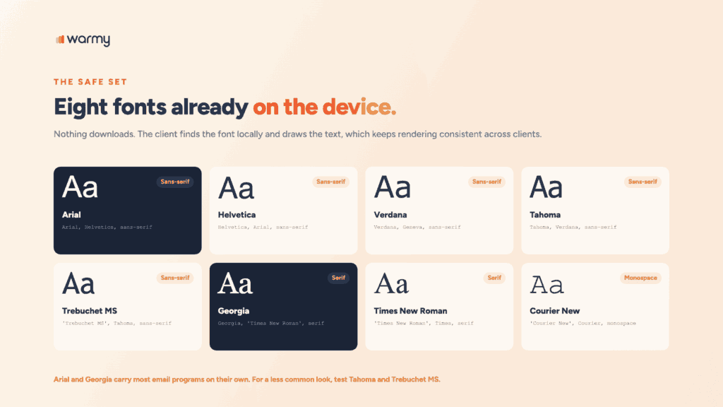
Arial and Georgia carry most email programs on their own. If you want a less common look without leaving safe territory, test Tahoma and Trebuchet MS.
How to Set Up a Font Stack (Fallback Fonts)
A font stack is an ordered list. The client tries the first name, moves to the second if it can’t find it, and keeps going until it reaches the generic family at the end. Skip that last item and the client picks for you, which is how a careful sans-serif design ends up in Times New Roman.
Here are three css web safe fonts stacks you can drop straight into a template:
/* Sans-serif */
font-family: Helvetica, Arial, sans-serif;

/* Serif */
font-family: Georgia, 'Times New Roman', Times, serif;

/* Monospace, for receipts and code */
font-family: 'Courier New', Courier, monospace;
Email needs those declarations inline, on the element itself, because several clients strip <style> blocks:
<td style="font-family: Helvetica, Arial, sans-serif;
           font-size: 16px;
           line-height: 1.5;
           color: #1a1a1a;">
  Your body copy goes here.
</td>
Two things to keep in mind: Match the category, meaning a sans-serif never falls back to a serif. And keep the list short: your font, one or two web-safe alternates, then the generic family.
Using Custom Web Fonts in Email (and when not to)
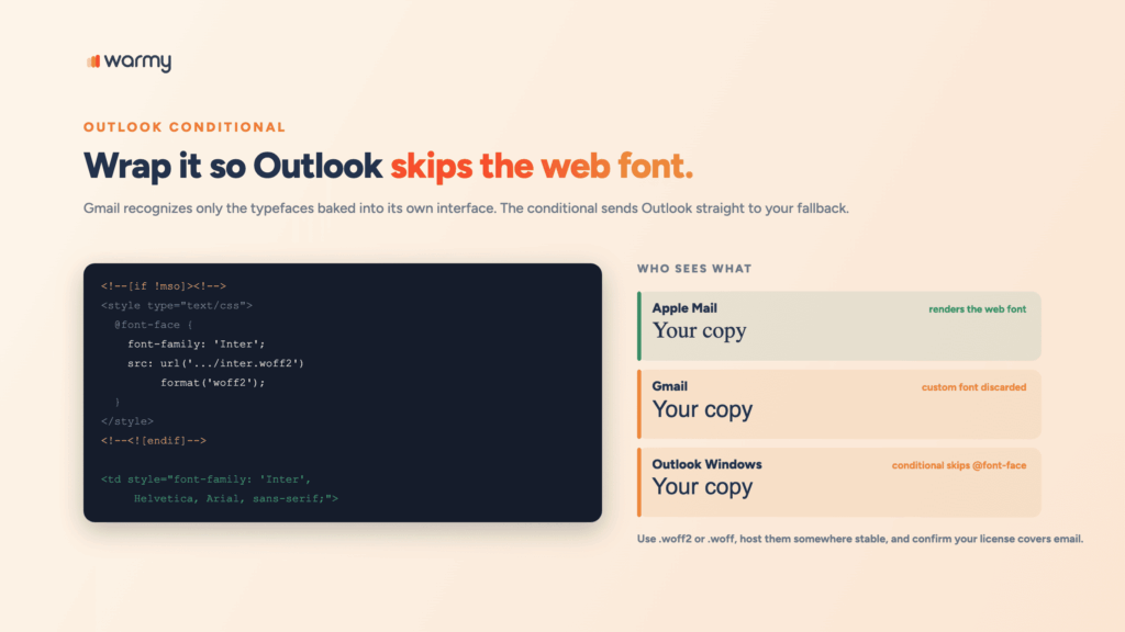
Custom fonts earn their keep when your audience skews toward Apple Mail, which renders them well. For a B2B list living in Gmail and Outlook for Windows, the effort mostly buys you a fallback you should have designed properly anyway.
If you do use one, wrap the declaration so Outlook skips it and jumps to your fallback:
<!--[if !mso]><!-->
<style type="text/css">
  @font-face {
    font-family: 'Inter';
    font-style: normal;
    font-weight: 400;
    src: url('https://yourdomain.com/fonts/inter-regular.woff2')
         format('woff2');
  }
</style>
<!--<![endif]-->

<td style="font-family: 'Inter', Helvetica, Arial, sans-serif;
           font-size: 16px;">
  Gmail and Outlook readers see Helvetica or Arial.
  Everyone else sees Inter.
</td>
Use .woff2 or .woff files, host them somewhere stable, and confirm your license covers email. Gmail is the notable holdout: it recognizes only the handful of typefaces baked into its own interface and discards the rest.
Font Pairing and Readability Best Practices
- Cap it at two typefaces, one for headings and one for body. Weight and size handle the rest.
- Pair across categories. A serif heading over the sans-serif body reads cleanly; two similar sans-serifs look like a mistake.
- Set body text at 16px, never below 14px. iOS bumps tiny text up on its own and breaks your layout.
- Keep line-height between 1.4 and 1.6. Tight leading makes good copy feel like work.
- Match x-heights when you pick a fallback, or the layout shifts for everyone who gets the backup.
Fonts for Different Email Types (Signature, Newsletter, Transactional)
| Email type | Recommended font | Reasoning |
|---|---|---|
| Email signature | Arial or Helvetica, 12 to 14px | Signatures get quoted into threads, where unusual fonts collapse to the client default. |
| Newsletter | Georgia headings with Arial or Verdana body | Serif headings give hierarchy; the sans-serif body holds up on small screens. |
| Transactional | Verdana or Tahoma | Wide letterforms make order numbers and codes easier to scan. |
| Cold outreach | The recipient’s client default | Plain text reads like a person wrote it. Heavy styling reads like a campaign. |
Signatures travel further than anything else you send. Build one with images, odd fonts, or nested tables and it breaks the moment somebody replies. Warmy’s free Signature Builder lets you build a signature with a safe, readable font and clean HTML that survives forwarding.
<table role="presentation" cellpadding="0" cellspacing="0" border="0">
  <tr>
    <td style="font-family: Arial, Helvetica, sans-serif;
               font-size: 14px;
               line-height: 1.4;
               color: #333333;">
      <strong>Daniel Shnaider</strong><br>
      Email Deliverability Expert, Warmy<br>
      <a href="https://www.warmy.io/" style="color: #0057ff;">warmy.io</a>
    </td>
  </tr>
</table>
Common Font Mistakes That Hurt Readability and Deliverability
- Building the email as a single image to preserve a brand font.
- Ending a font stack without a generic family, which hands the decision to the client.
- Falling back from a sans-serif to a serif, or the reverse, which reflows the layout.
- Using more than two typefaces in one message.
- Setting body copy below 14px because the design looked tighter that way.
- Relying on a
<style>block instead of inline styles Gmail can’t strip. - Skipping the Outlook conditional, which turns brand fonts into Times New Roman.
- Picking colors that clear brand guidelines and fail a basic contrast check.
Pre-Send Testing Checklist
- Preview in Gmail web, Gmail mobile, Outlook for Windows, Apple Mail, and Yahoo Mail.
- Turn images off and confirm the message still makes sense as live text.
- Check that every declaration is inline and every stack ends with a generic family.
- Verify body copy sits at 14px or larger with line-height between 1.4 and 1.6.
- Run a contrast check on body text, headings, and button labels.
- Confirm the live-text-to-image ratio leans toward text.
- Test how your fonts render before you send, using a scanner rather than your own inbox.
For the layout side of the same job, check the full layout and sizing guidelines for your template.
Warmy’s free Template Checker scans your message for spam triggers and formatting problems and scores it against deliverability best practices. A Chrome Extension covers the same checks in your browser.
Conclusion
The best font for emails is the one that renders the same way for every reader on your list. In practice that means a web-safe font at the front of the stack, or a custom font backed by a fallback in the same category, and live text everywhere the copy matters.
Typography is the part you control directly. What you can’t control by hand is how Gmail, Outlook, and Yahoo score your domain over time, and that score decides whether any of this design work reaches a human. Warmy handles that side with AI-driven warmup, domain health monitoring, and inbox placement testing across every major provider. Book a demo and see where your emails actually land.